Your logo should be the most
recognized part of your
company’s branding efforts. It is the eggs in the cake, the glue in the
veneer,
the mortar in the bricks… you get the idea. Without it, you have nothing
sticky
to hold the rest of your branding components together.
This is not some earth-shattering marketing secret. I suppose
every person who starts a business thinks about a logo. The breakdown
often
occurs in not thinking through all of the implications of the logo.
Beyond the
sign on your door, your business card and your web site, where will it
be used?
How will it be used? Are you building some structure around its usage so
you
don’t end up with millions of shades of the logo? At the same time, are
you
building some acceptable variations so you allow some creativity?

 The first step of logo development should be to design a
graphic that is eye catching and is understood for what it is in a split
second. Logos are typically very simple. They are meant to be
identifiable at a
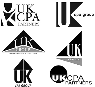
glance. To that end, we typically start to design a logo without color.
If you
view the logo in black and white, you reduce it to just its graphic
parts. Then
you are able to do the glance test; giving it the quick look to see if
you can
read and understand what the logo is in a split second. This will help
you
identify the elements of a logo that are easy to recognize and those
that are
too complicated for your brain to decipher in that split second. Take a
look at
the variations of the UK CPA Group logo that we did early on to help the
client
decide on a new design. Using black and white helped the client to
decide which
elements of the logo they liked, which communicated quickly and what
fonts made
the most impact with those graphic components. After you have the black
and
white agreed upon, then you are ready to add color.
Make sure your logo is a mark that identifies your company
and nothing more. One common mistake made by businesses is thinking they
need
to tell some complicated story with their logo. I have known competitors of ours that
will
take you through lengthy evaluations on corporate values, mission
statements
and directional vision and expect to design a logo that can somehow
communicate
all of that. There is nothing wrong with these types of discussions, it’s just asking too much
to find all of these
ideas embodied in a graphic symbol as simple as a logo. I remember
sitting as an
observer in a focus group evaluating such a logo. The moderator kept
asking,
"What values does this logo communicate? What emotion do you feel when
you see
this logo?” No one could find any value statements or emotions in his
logo
examples, so he kept asking the same questions. Finally, one frustrated soul
said,
"I felt nothing at first, but I am starting to feel anger because I have
a desk
full of work to do and you won’t let me go until I express some
emotion!”
Corporate logos are not emotional artwork. They are not paintings of
resistance
during the Impressionist era. They are meant to be a mark of
identification.
There is a place for emotion in sales and marketing. I would contend that most of what we purchase on a consumer level is bought by appealing to emotion, but it is not in the logo. The logo is simply an identification mark. When I go into a convenience store and I see the "Hersheys” logo by the checkout, I know I am
dealing with a chocolate bar. I might have a craving, but no real
emotion. And
I could not give you the mission statement of the Hershey corporation no matter how long I stared at the logo on the candy bar wrapper.
Once you have an idea of the design of the logo, two rules
should apply. The first rule is standardization. There needs to be a
consistency in how the logo is used. Establish a color palette. Decide
what
happens in single color applications, where your corporate color is not
available (such as black and white print), how large proportionally the
logo
should be used in comparison to its background, etc. The value of a good
logo
is that it identifies everything that is a part of your business. Being
consistent will help this.
 The second rule is to allow for some variations to happen.
Most of this will come in proportions. For instance, if you print your
logo on
your business card, you are viewing the logo inches from your face. It
should
be no problem to understand the logo at that close proximity. If you put
it on
a sign on the outside of a building, you may need to enlarge certain
elements
to keep it readable at a distance. Take
a look at the UK CPA Group sign on the outside of their building. We
increased the size of the text to make sure you could read it from the
street.
Another proportional change that can happen is when the logo is used in a
tight
vertical or horizontal format. For instance, most web site banners are very long and squatty, horizontal formats. A banner stand at a trade show is a very tall and narrow vertical format. Thinking through these types of variances will make your logo work in more than one situation.
 Another place where some leeway for variations can come
into
play is in creativity. Have you given some creative license to the way
the logo
is used? Take a look at the IMI logo. We have made variations for
advertising,
such as the flag logo; for marketing campaigns, such as the green leaf
logo;
and for corporate giving, such as the education logo.
 So
when should you stick to the first rule for consistency’s sake and when
should
you allow for variations? Here is our general rule of thumb: stick with
the
first rule of standardization most of the time and make variations a
rarity. If
the logo is to be recognized as your distinct brand, then the rule of
standardization should be in place on your web site, on your business
cards, on
the signage in front of your locations. Whenever you have a branded
component
of the business that will be seen with other, similar components, stick
with
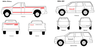
the first rule of standardization. Examples would be packaging of
products and
fleet vehicles graphics. Take a look at the IMI decal placement that we
designed for their corporate identification manual. This makes sure that
all
logos are consistent and placed in the same place on all vehicles.
Regarding
rule two, when you are dealing with a specific cause, advertising
campaign or
emphasis, creative variations in the logo should be acceptable as long
as the
components of the logo (font, graphic elements) are not eliminated or
changed.
Never forget that the main job of the logo is to identify your company. This is the first rule of branding.
Never leave the viewer guessing who they are dealing with when they look at anything associated with your company.