 Is your brand getting old? Is there value in holding onto the old logo
or does it need to be freshened up? When is it time to ditch your old logo and
rebrand? Maybe you are thinking of even going further and renaming your brand
with a completely new name.
Is your brand getting old? Is there value in holding onto the old logo
or does it need to be freshened up? When is it time to ditch your old logo and
rebrand? Maybe you are thinking of even going further and renaming your brand
with a completely new name.
What is the difference between a brand and a logo? A brand is a name we
use to define a business entity, a product or a service. A logo is a
representation of your brand to the customer, and it becomes so familiar to
them that they recognize the brand with just a quick glance at the logo. For
instance, I know the giant "G” on an orange lightning bolt is Gatorade. A white
wave on a red background is Coca-Cola. Those logos are so familiar, just a
description brings the brand to mind.
Sometimes there are good reasons to modify the look of your logo,
especially if marketing factors have changed. It could be that your target
market has changed and your logo no longer reflects their taste. It could be
that your company has changed and you need to inform the public about it (think
of a merger or acquisition). It also could be that you are promoting something
new and want to reach out to a specific demographic group. Before you go all-in
on rebranding, evaluate the value of your current brand first. Do the consumers
in your target market know your brand name? If not, you may want to consider a
new brand and come up with a new name altogether. However, if they know your
name, but are not responding to your logo, it is time to rebrand to catch their
attention.
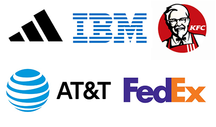
To demonstrate what I am talking about, let’s look at some of the most
famous brands and the logos that have been used to represent them over time.
See how each of them has changed and the reason behind the rebrand or new
brand.
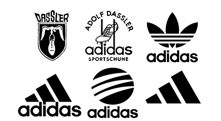 Adidas
Take a look at these Adidas logos over the years. Their founder, Adolph
(Adi) Dassler, started the shoe company with his brother, Rudolf. After a few
years, the brothers split up and Adi changed the name of his brand from Dassler
Shoes to Adidas (a shortened version of his name Adi-Das). Notice that each
logo has kept the three stripes from the original logo and the same font until
2022 when the reductionist logo kept the "Adidas Mountain” without the name of
the brand. As you can see, they freshened up each logo for a new generation without
getting rid of the most identifiable graphic.
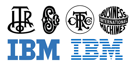 IBM
IBM
Sometimes a new brand is what is needed, especially as the technology
around a brand changes. At its founding, International Time Recording Co.
shortened its name to ITR, which was reflected in its logo. Later, the brand
was changed to Computing Scale Co. and then to Computer Tabulating Recording
Co. The brand was then changed to International Business Machines before being
shortened to IBM. For all of these new brands, what is very unique about the
IBM logo is that it has changed very little since it became a three-letter
brand in 1946. During that time, it became so iconic that people would refer to
the color of the logo as the nickname, "Big Blue” to indicate the brand.
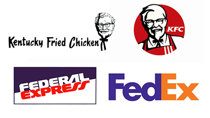 KFC and FedEx
Another good reason to rebrand reflects the way your target market
refers to you. We tend to shorten brand names the more familiar we are with
them. Much like the acronym, IBM, both Kentucky Fried Chicken and Federal
Express rebranded to embrace the vernacular of their target market. This not
only allowed them to refresh their look for a modern customer, but it also
helped them become more memorable. How so? Anytime you can shorten a brand name
and consumers remember it, do so. People have a better chance of remembering
shorter names. But we also create shortened versions or nicknames of people who
are closest to us. The same can be said of brands.
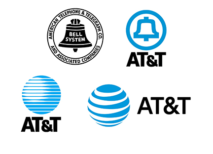 AT&T
AT&T
Finally, let’s look at another reason to change your logo. Sometimes
there are grounds for making a break from your past. In 1984, AT&T was
broken up after being found to have a monopoly on the telephone industry. The
company originally known as American Telephone and Telegraph had long used the
image of a bell on their logo – to the point that many people referred to the
company as "Ma Bell.” However, after the company was forced to split into seven
companies, the bell on the logo needed to go away. The graphic globe was used
to replace it.
If you are considering changing your logo, ponder what your brand means
to your customers. Is the logo representing you well? If not, it is time for a
change. If the brand is not being recognized in the marketplace, it may be time
to come up with a new brand. If you simply need a new look, examine what
aspects of your current logo are most appealing to customers. Keep those
elements in your new style.